USER RESEARCH • UX DESIGN • UI DESIGN • USER TESTING
AskLily uses artificial intelligence and machine learning technology to deliver a personalized ecommerce experience. I led the design and usability testing of the web platform as the business adopted a B2B model.
My Role
User research Market research UX Design UI Design Visual Design Prototyping Usability testing
PLATFORM
Mobile web
Year
2020
PROBLEM
Shopping online for clothing gives women infinite options, however sifting through the different styles coupled with very little guidance on fit and sizing creates frustration, which leads to an abandoned shopping experience.
A PEEK AT THE SOLUTION
AskLily strives to provide a service that personalizes and simplifies the online shopping experience for women across the globe.
Background
Prior to bringing me on, the company had launched a beta test of the service to serve as a B2C concept. During the beta test users expressed a great desire to use a service such as this on their favorite retailer sites, to help them quickly narrow down options.
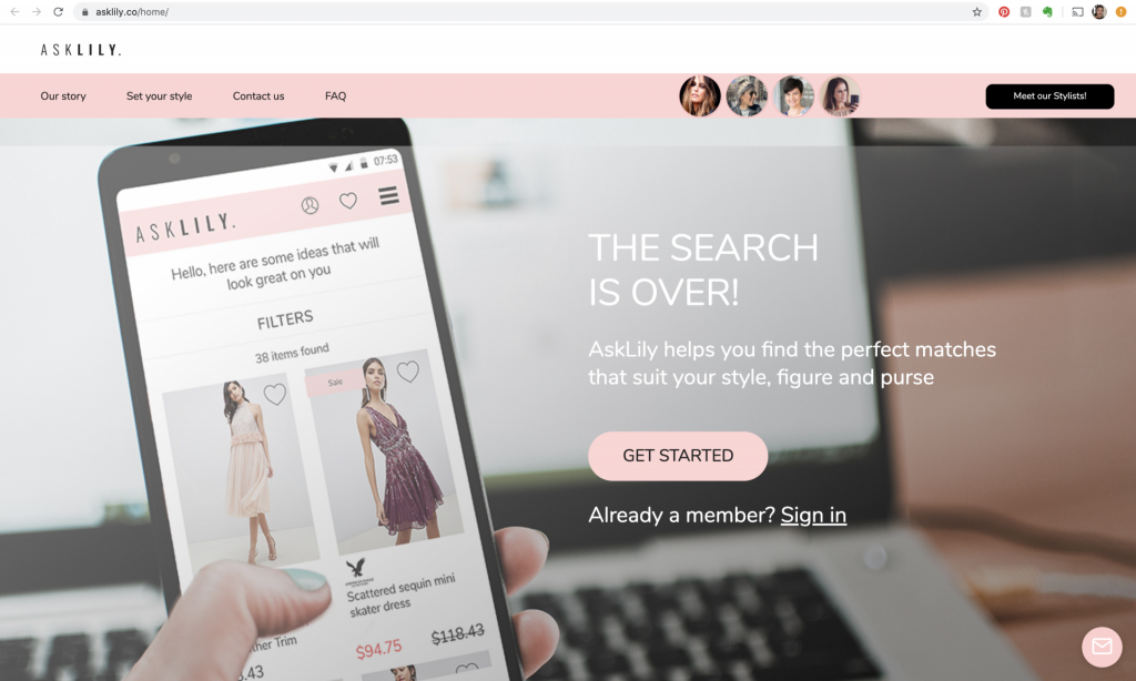
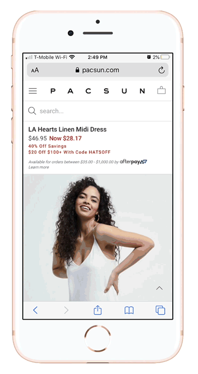
What the B2C platform looked like before the B2B pivot.
To get a better understanding of the service, the market segment and what had already been done I started with the following.
Stakeholder interviews
Analysis & synthesis of research
Competitor analysis
User research & Testing
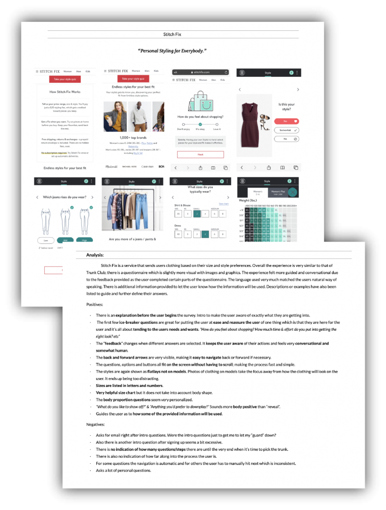
Competitive Analysis
What does personalized e-commerce look like currently?
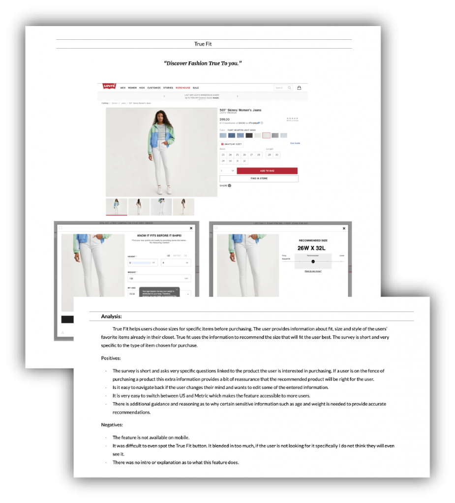
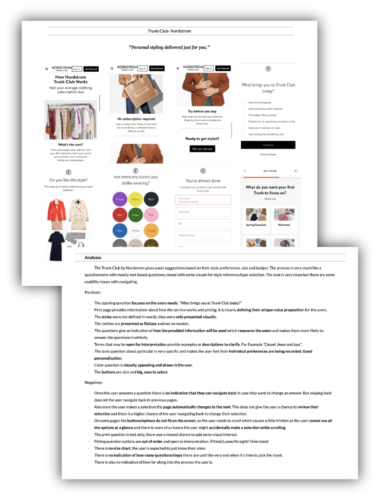
There are a few web platform that offer personalized e-commerce, the experiences resemble the experience of shopping with a personal stylist or personal shopper. I evaluated three top rated services to identify best practices and areas of improvement to implement into the new B2B design.
User Research
I created a questionnaire to gather qualitative data about the users, their online shopping habits, their needs and their pain points. I also used the questionnaire as an opportunity to recruit users for usability testing.
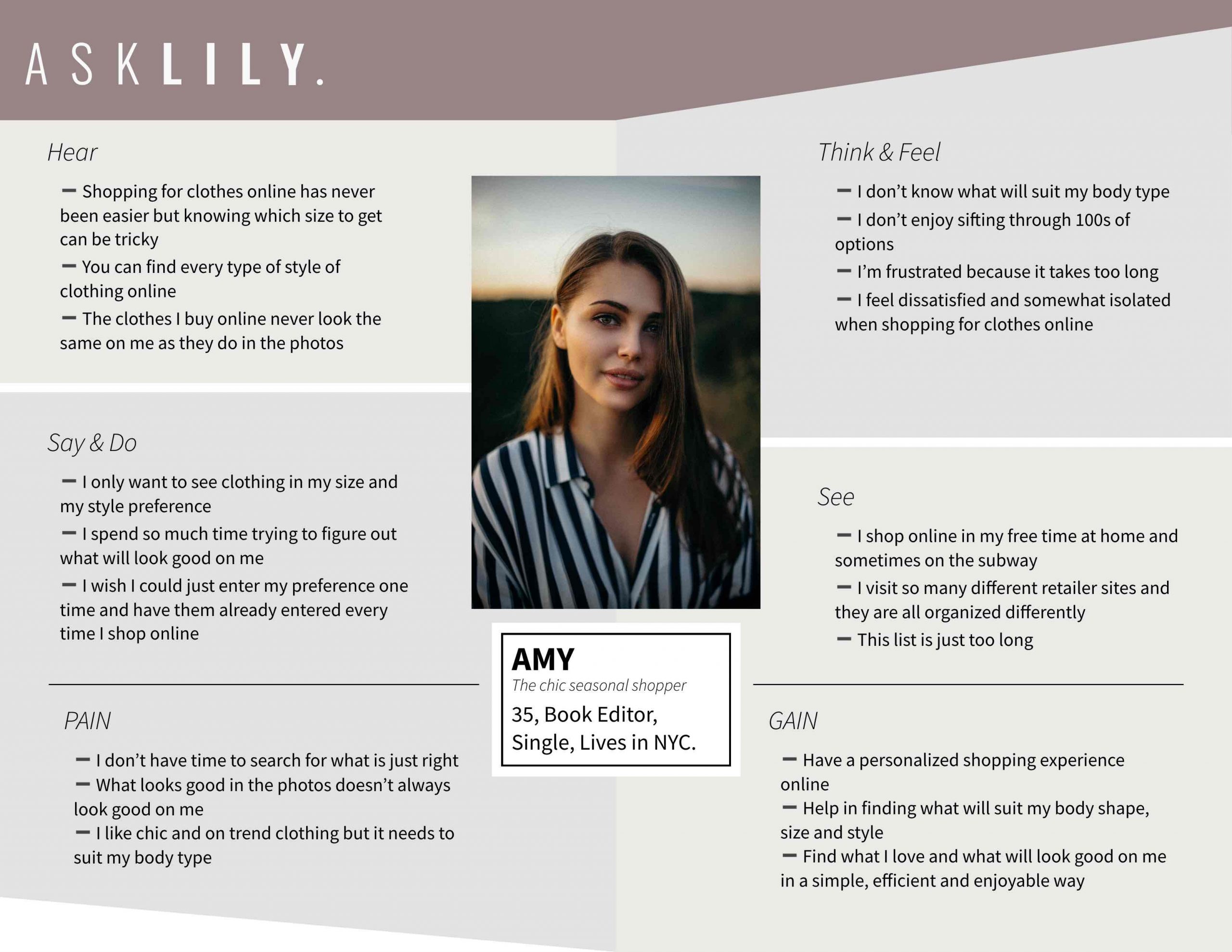
Defining the user and understanding her needs
The business model is pivoting to B2B but shoppers are still the users
Empathy Map
USER PERSONA
With so many clothing options available online, finding options that are just right for Amy's individual body type and style preference feels like a complicated and impersonal journey.
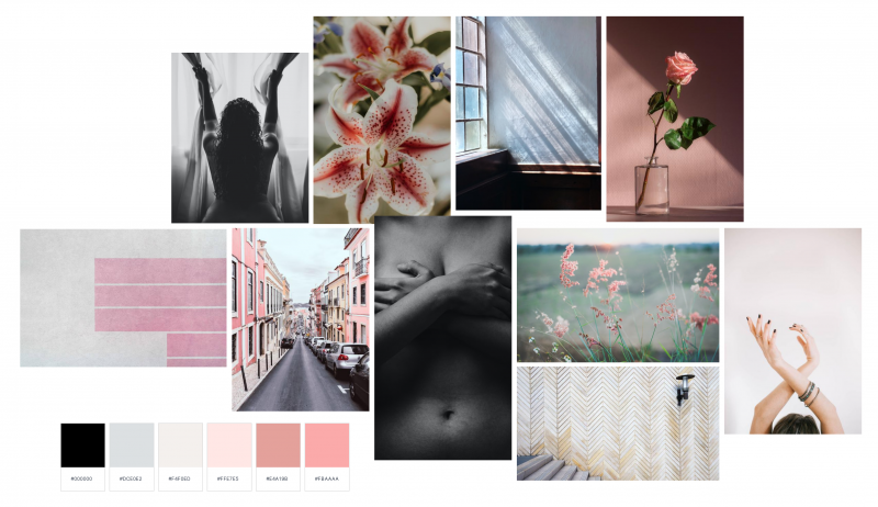
MOODBOARD
Theme•Body Positivity & Confidence
Modern • Sophisticated •Calming
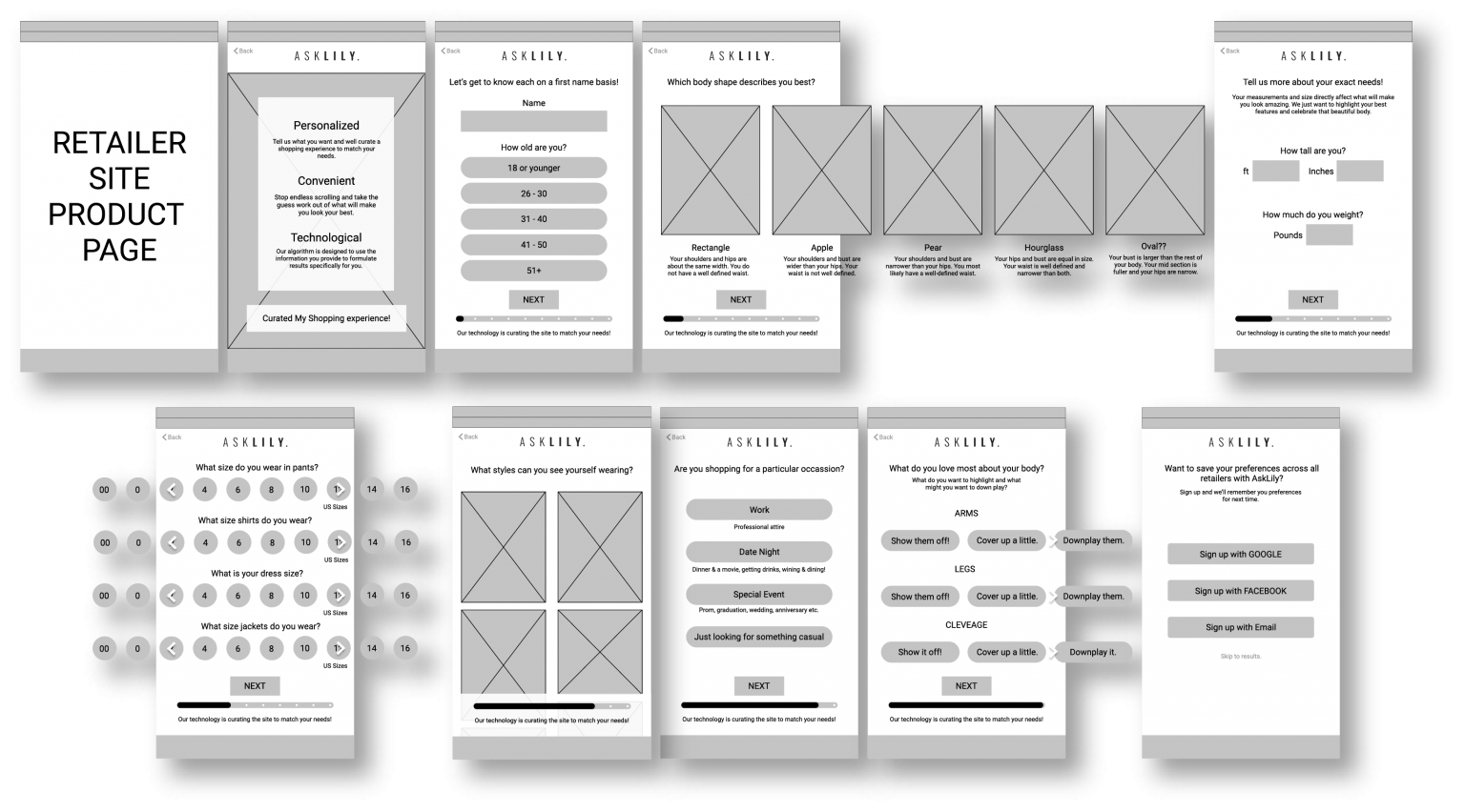
IDEATION
Using the feedback and insights gained during the first round of testing, I created sketches followed by wireframes of a new flow and design. The main issues and areas of friction were addressed by implementing the following:
•
Clearly describing the service and its benefits for the users.
•
Presenting clearer options that make it easier for the user to choose.
•
Shortening the flow and reducing the number of screen.
•
Rewording questions and presenting them in a way that is body positive.
Wireframes
User TestinG • round one
I took the existing B2C beta test as a starting point. I quickly creating a prototype by taking screenshots of the user-flow as it was and embedding a starting point on a third party retailers website. I used this prototype to test the experience of the existing flow and the new B2B business model which was being adopted. Below I share some the insights gained during the test and the redesigned screens that were tested in round two.
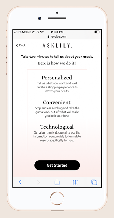
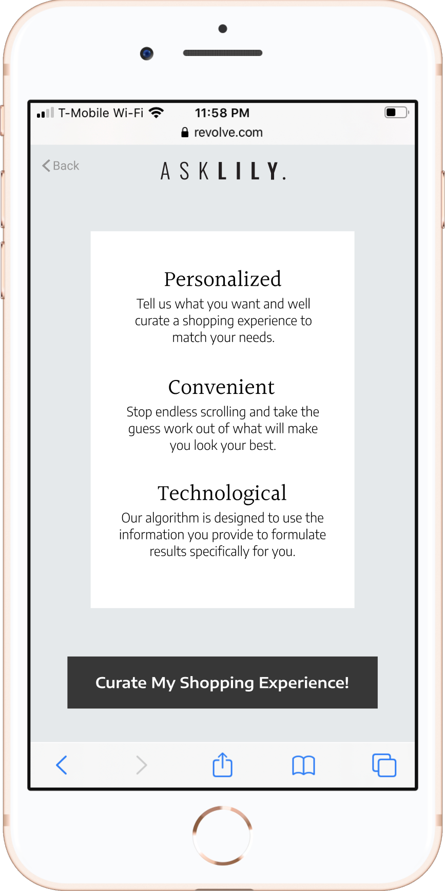
Insight #1 • No introduction left users Feeling confused
Insight #2 • All users tried to skip the style preference
After discovering and clicking the AskLily button users were thrown straight into the first question about style preferences. The lack of an introduction to the service left the users feeling uncertain of what they were actually working towards.
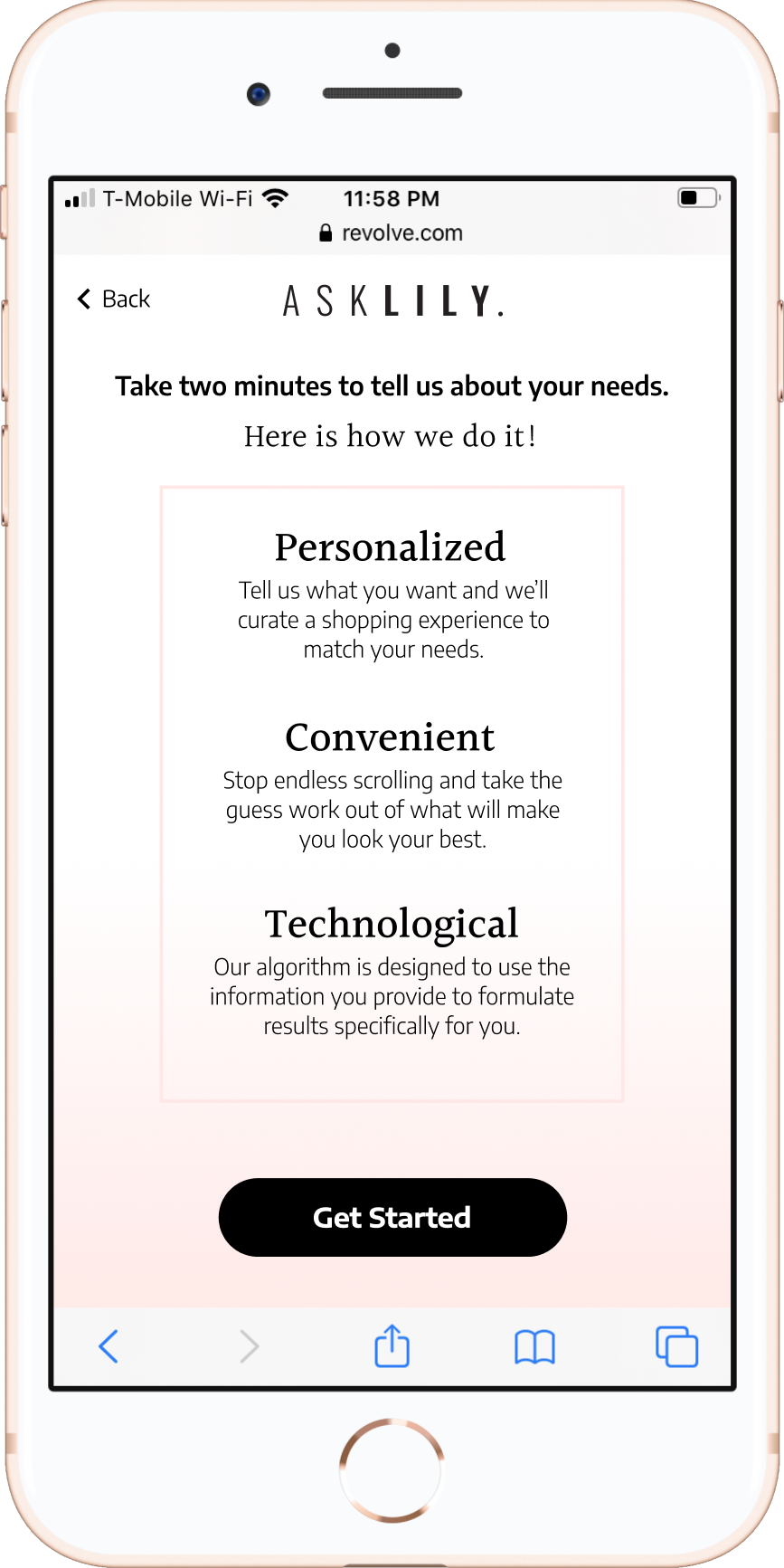
Also the style preference question lasted a lengthy twelve screens. For the second iteration we presented a vertical scroll single screen version which was received very well and revealed users actually prefer to incorporate multiple styles into their wardrobes. This reassured the stakeholders that the service provided most value in curating by body shape.
BEFORE
AFTER
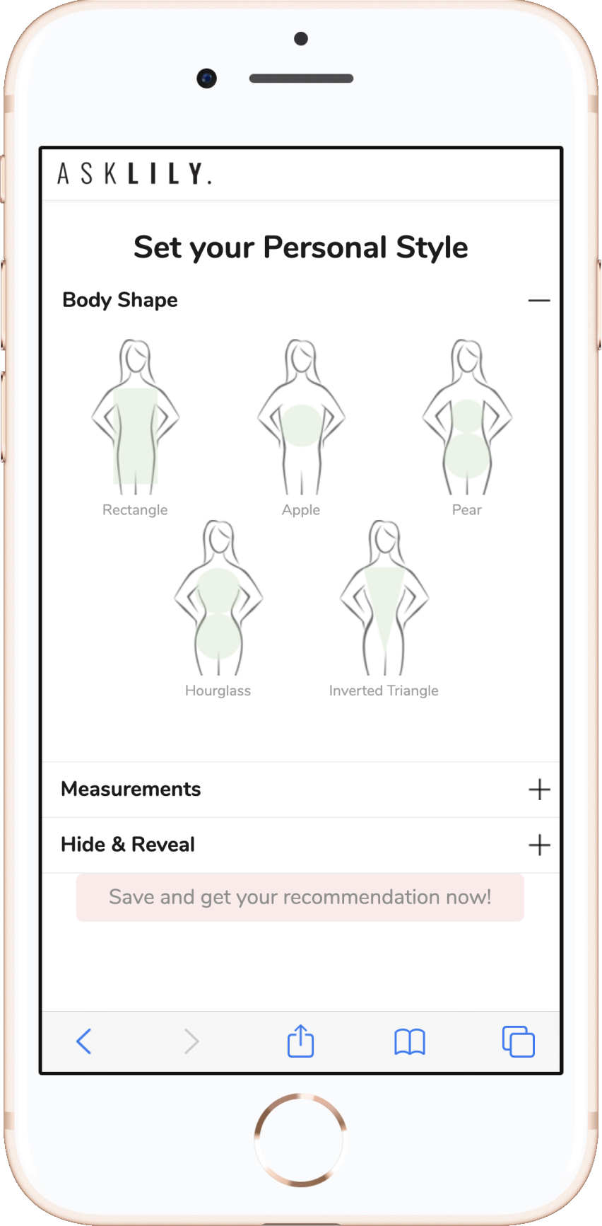
insight #3 • Users didn't understand the Significance of the "Body Shape" Question
BEFORE
AFTER
Users were not introduced to the unique selling proposition of shopping by "Body Shape" until after the excessive twelve-screen style preference question. When they finally arrived at the question they were intrigued but underwhelmed.
For the second iteration we presented the "Body Shape" question at the beginning of the flow. Users responded to this with delight and felt more informed about how the service actually works. They also responded well to the new visuals but not everyone was able to identify themself in the presented options.
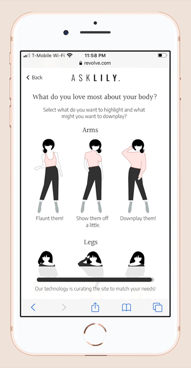
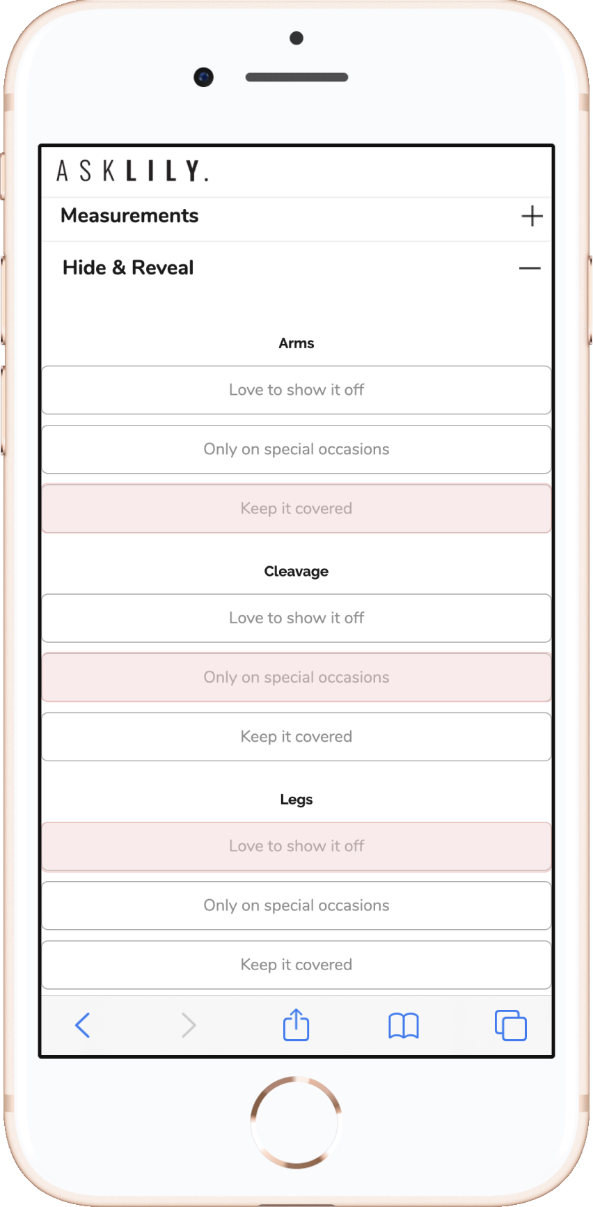
Insight #4 • The "hide & reveal" question caused Discomfort
BEFORE
After
Users did not respond particularly well to the "Hide and Reveal" question. They disliked the entire interaction.
The second iteration received a much more positive reaction. Users mentioned the illustrations to be very easy to understand and the visual element helped them make a decision quickly and easily.
How can we show women a representation of their individual selves online in-order to reassure them that the curated selections are truly personalized for their individual body shape, size and style preferences?
User TestinG • round two
I then created a clickable prototype of the new design and tested it with five participants. Below I share the insights gained during the second round of testing and the screens which were iterated based upon the user feedback.
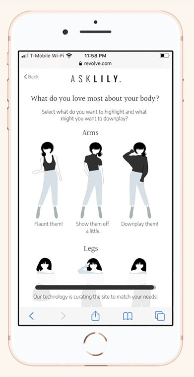
Insight #1 • Users wanted a better representation of their body Shape
More than anything else users wanted to be able to see themselves represented on the screen when shopping for clothes online, so that they can relate and visualize the clothes on themselves. One user said the illustrations were an "idealized version" of what women look like. Many users wanted to see body shapes and sizes that were closer to their own.
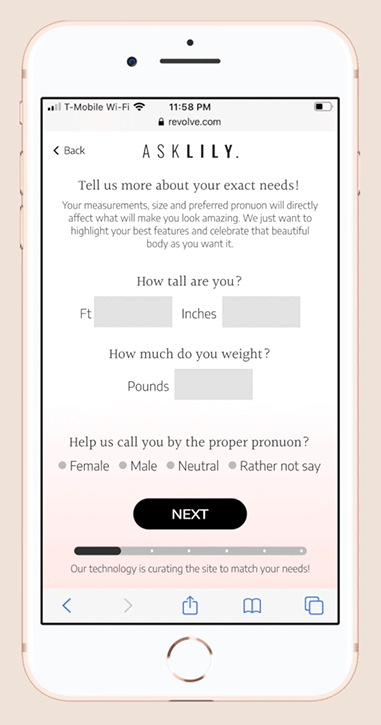
For the third iteration we created multiple illustrations for each body shape to represent three user personas of three different sizes. Once the user selects their height and weight they are redirected to the illustration that would be most representative of their actual body. (See iterations below)
BEFORE
AFTER
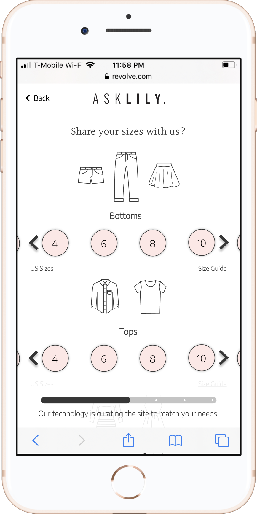
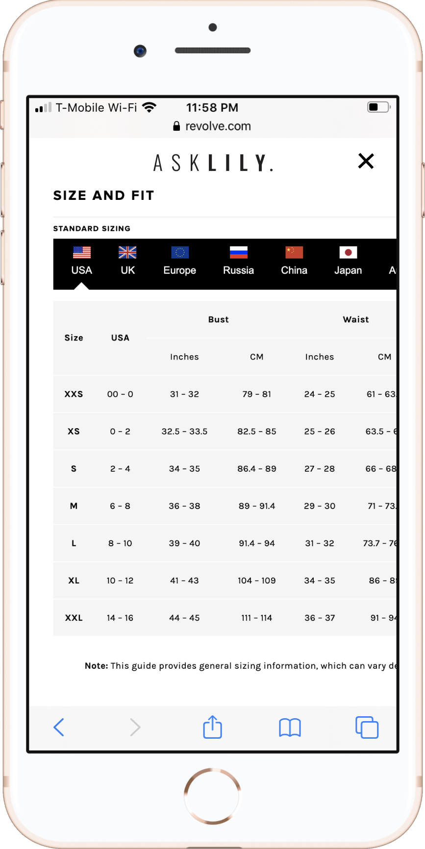
INSIGHT #2 • Users were concerned about Inconsistency of sizing
Screens from the Final design
Users were hesitant to pick sizes, they were concerned about inconsistency of sizing from one retailer to another. They mentioned measurement as a way to be certain of their sizes. For the third iteration we integrated the targeted retailers size guide directly on to the sizing screen of the flow, to help users determine their size without needing to navigate away.
INSIGHT #3 • The CAll To Action was unclear & the intro did'nt grab the user's attention
BEFORE
AFTER
BEFORE
AFTER
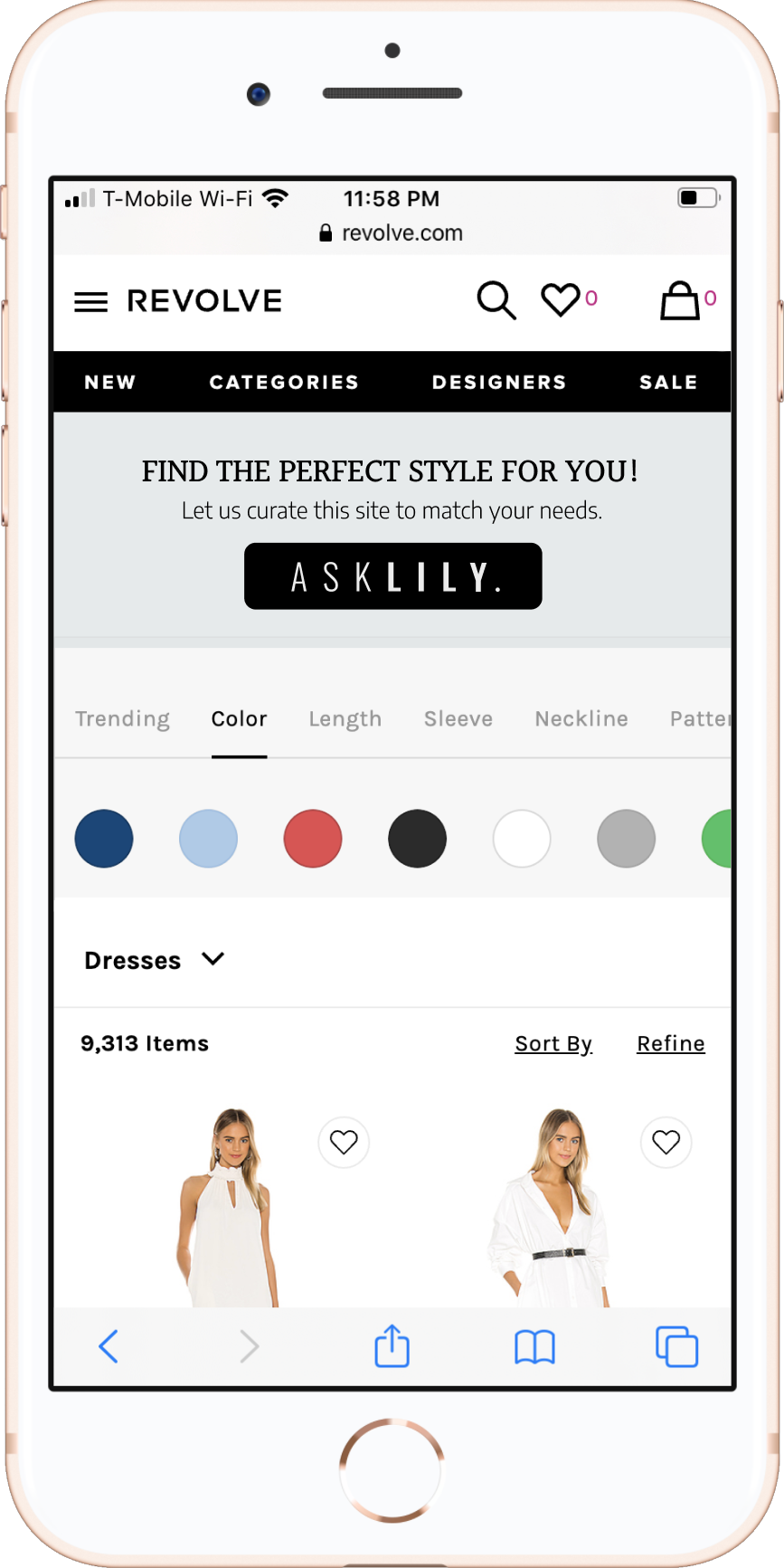
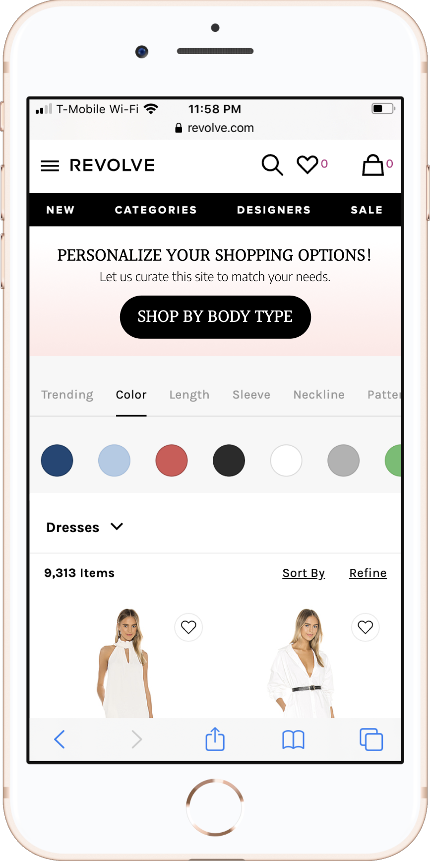
INSIGHT #4 • The user was unsure about what service AskLily provided
Users took a long time to even discover the AskLily button and then proceeded to quickly skim over the introduction screen. Which in turn left them a little unsure of what exactly the service provided until they were much further along in the process.
For the third iteration of the design we made the call to action button and messaging on the banner very clear, so that the user is aware of the value the service will provide to them. We also added some instructions to the introduction screen to further inform the user.
WHAt I learned
I learned to start the process with what has already been done and getting the product in front of users as early as possible. By using the existing B2C flow and quickly getting it in front of users, we avoided starting from scratch and we were able to get to the root of problem. We made improvements in direct response to real user’s pain points.
As the team I worked with was based in Israel I learned to communicate effectively in a remote setting across timezones. I had to be concise, convincing and clear in order to get buy in from the CEO and the CMO. I used live user testing to let the stakeholders hear what their users had to say and based design decision on those insights. Additionally I discovered creating video walk-throughs of deliverables is greatly advantageous when real time meetings and reviews may not be possible.